Skip to content
Entangle Media
  • Home
  • About Us
  • Services
    • Custom Website Development
    • App Development
    • Concierge Brand Management
    • Managed WordPress Hosting
    • 3D Anatomy
    • Social Media Management
    • Medical Industry
    • SEO Consulting
    • Reputation Management
    • Optimize Local Results
    • Website Maintenance
    • SSL Certificates
    • Copywriting
    • Domain Names
  • Portfolio
    • Web Design
    • Apps
    • Animation
    • Video
    • Graphics
    • Trial Exhibits
  • Brands
    • Entangle Media
    • Event Hut
    • Case Chronology
    • AI Camping
    • Deal My Brand
    • Your Internet Team
    • Thank You Post
    • Demonstrative Aids
  • Blog
  • Reviews
  • Contact Us
  • Client Login
  • Support
  • Legal
    • Terms of Service
    • Privacy Policy
    • Acceptable Use Policy
813-513-7447
facebook twitter
© 2025 Entangle Media. All rights reserved

Designing with “White Space”

Posted on June 7, 2017   |    by John Karl   |   No Comments   |   web

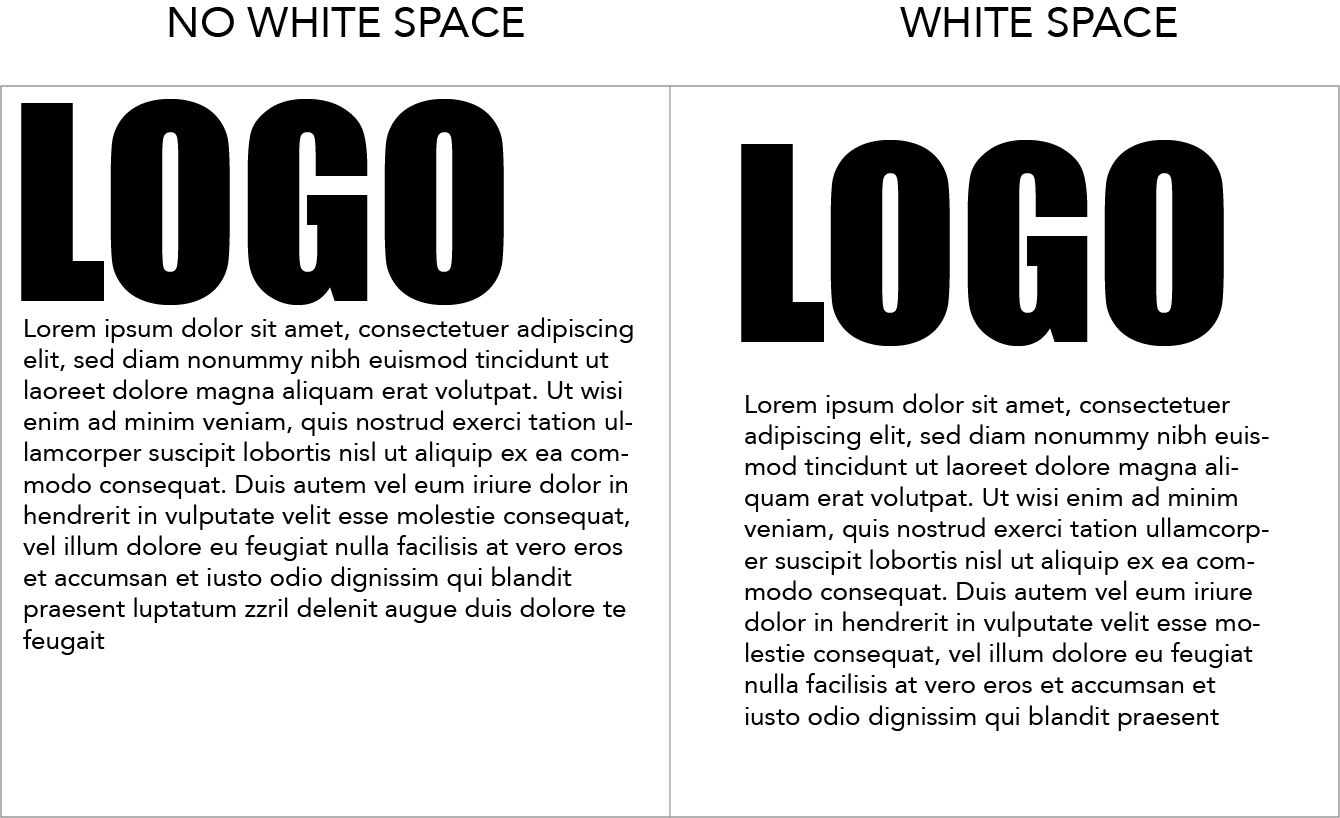
In my design adventures, I have often run into designers that don’t understand "white space". The concept was drilled into my head ever since my first design class in college. "White Space" is the empty areas around different text, graphics, assets or edges of the finished piece. For example. When you design a website the human brain needs separation to comprehend what the message is you are trying to relay with your design. If you put the objects to close together it makes your brain think those two assets must be connected. Human brains need separation to finish a thought. If I put a logo on the top of the page for branding and it is placed right next to the top it makes you feel uneasy. Your brain is unsure of what message you are trying to relay. But just by giving it some "white space" the viewer can see the logo and move on to the next asset without interruption.

Look at this web app design. All the assets are very close together and it makes it hard to read and even harder for your brain to comprehend.

Now if you look at the "white space" version. You can see the branding and your unrest seems to melt away helping you continue to the next asset available. 

The simple difference in the presentation helps the viewer comprehend what it is you are trying to relay. Don’t be afraid to experiment when you design your next project but keep "white space" in mind. Your clients will thank you for it.

  • facebook
  • twitter
  • linkedin
  • pinterest
 Audio Leads to Better Videos
Entangle Media member wins community award. 
John Karl
John Karl

All author posts
Related Posts
The Case for Disabling WP-Cron
December 15, 2017 | by admin The Case for Disabling WP-Cron

WP-Cron is a built-in WordPress feature for running scheduled tasks and time-based processes. The trigger for running WP-Cron is based […]

Our WordPress Philosophy
December 13, 2017 | by admin Our WordPress Philosophy

WordPress is an important framework we use when designing and developing websites for clients. We believe in client empowerment: One of the […]

The 3 Most Useful WordPress Hacks You’ll Wish You Knew of Sooner
September 1, 2017 | by admin The 3 Most Useful WordPress Hacks You’ll Wish You Knew of Sooner

WordPress is great at making most website management tasks easy, but sometimes you run into technical issues or need a […]

How To Prove The Value Of Social Media Strategy To Your CEO
January 30, 2017 | by admin How To Prove The Value Of Social Media Strategy To Your CEO

Even though social media is a big deal nowadays and every person and business has their social media accounts, some […]

Write A Comments

Cancel reply

Your email address will not be published. Required fields are marked *

© 2025 Entangle Media. All rights reserved.
Entangle Media
On social networks
  • facebook
  • twitter
Scroll Up Important Link